
In today’s digital age, creating a robust, visually appealing, and user-friendly website design company in patna is crucial for businesses and individuals alike. Two fundamental technologies that play a pivotal role in web development are HTML5 and CSS3. HTML5, the latest version of the HyperText Markup Language, and CSS3, the third version of Cascading Style Sheets, have revolutionized the way developers build and design websites. In this comprehensive guide, we will explore the ins and outs of using HTML5 and CSS3 for modern web development, covering essential features, best practices, and practical tips to help you create stunning websites.
Understanding HTML5 and CSS3
HTML5: The Backbone of Web Development
HTML5 is the standard markup language for creating web pages. It is the fifth major version of HTML and introduces several new features and enhancements over its predecessors. HTML5 provides a more structured and semantic approach to web development, making it easier for developers to create content that is both machine-readable and human-readable.
Key Features of HTML5
- Semantic Elements: HTML5 introduces new semantic elements like
<header>,<footer>,<article>,<section>, and<nav>. These elements help define the structure of a webpage, making it more accessible and SEO-friendly. - Multimedia Support: HTML5 natively supports audio and video elements through
<audio>and<video>tags, eliminating the need for external plugins like Flash. - Canvas Element: The
<canvas>element allows developers to draw graphics on the fly using JavaScript, enabling the creation of dynamic and interactive web applications. - Geolocation API: HTML5 includes a Geolocation API that allows websites to access the user’s geographical location, enabling location-based services and personalized content.
- Web Storage: HTML5 provides two types of web storage mechanisms: local storage and session storage. These mechanisms allow developers to store data on the client’s browser, improving performance and enabling offline capabilities.
CSS3 : Styling the Website
- CSS3 is the latest version of the Cascading Style Sheets language used for describing the presentation of a document written in HTML. CSS3 introduces a range of new features and capabilities, allowing developers to create visually stunning and responsive websites.
Key Features of CSS3
- Selectors and Pseudo-Classes: CSS3 introduces new selectors and pseudo-classes, making it easier to target specific elements and apply styles based on their state.
- Box Model Enhancements: CSS3 includes features like border-radius, box-shadow, and background gradients, allowing for more creative and visually appealing designs.
- Transitions and Animations: CSS3 supports transitions and keyframe animations, enabling smooth and visually appealing animations without the need for JavaScript.
- Flexbox and Grid Layouts: CSS3 introduces flexible box (Flexbox) and grid layouts, providing powerful tools for creating responsive and dynamic layouts.
- Media Queries: Media queries in CSS3 allow developers to create responsive designs that adapt to different screen sizes and devices, ensuring a consistent user experience across platforms.
Building a Modern Website with HTML5 and CSS3
Now that we have a solid understanding of the key features of HTML5 and CSS3, let’s dive into the process of building a modern website using these technologies. We will cover the essential steps and best practices to help you create a visually appealing, responsive, and SEO-friendly website.
Step 1: Planning and Designing Your Website
Before diving into the code, it’s crucial to plan and design your website. This involves understanding your target audience, defining the purpose of your website, and creating a wireframe or mockup to visualize the layout and structure.
Define Your Target Audience
Understanding your target audience is essential for creating a website that meets their needs and expectations. Consider factors such as age, gender, interests, and browsing habits to tailor your content and design accordingly.
Create a Wireframe
A wireframe is a visual representation of your website’s layout, showing the placement of key elements such as the header, navigation, content sections, and footer. Tools like Adobe XD, Figma, and Sketch can help you create detailed wireframes.
Step 2: Setting Up Your HTML5 Structure
With a clear plan in place, it’s time to start coding. Begin by setting up the basic HTML5 structure for your website. Here’s a simple example:
<!DOCTYPE html>
<html lang="en">
<head>
<meta charset="UTF-8">
<meta name="viewport" content="width=device-width, initial-scale=1.0">
<title>My Modern Website</title>
<link rel="stylesheet" href="styles.css">
</head>
<body>
<header>
<h1>Welcome to My Modern Website</h1>
<nav>
<ul>
<li><a href="#home">Home</a></li>
<li><a href="#about">About</a></li>
<li><a href="#services">Services</a></li>
<li><a href="#contact">Contact</a></li>
</ul>
</nav>
</header>
<main>
<section id="home">
<h2>Home</h2>
<p>Welcome to our website. We provide top-notch services to meet your needs.</p>
</section>
<section id="about">
<h2>About</h2>
<p>Learn more about our company and our team.</p>
</section>
<section id="services">
<h2>Services</h2>
<p>Discover the range of services we offer.</p>
</section>
<section id="contact">
<h2>Contact</h2>
<p>Get in touch with us for more information.</p>
</section>
</main>
<footer>
<p>© 2024 My Modern Website. All rights reserved.</p>
</footer>
</body>
</html>
In this example, we use HTML5 semantic elements like <header>, <nav>, <main>, <section>, and <footer> to structure the content. This approach improves accessibility and SEO by providing clear and meaningful tags that describe the content.
Step 3: Styling Your Website with CSS3
With the HTML5 structure in place, it’s time to style your website using CSS3. Create a separate CSS file (e.g., styles.css) and link it to your HTML document. Here’s an example of how to style the website:
 /* styles.css */

/* Reset some default styles */
* {
    margin: 0;
    padding: 0;
    box-sizing: border-box;
}

body {
    font-family: Arial, sans-serif;
    line-height: 1.6;
    background-color: #f4f4f4;
    color: #333;
}

header {
    background-color: #333;
    color: #fff;
    padding: 1rem;
    text-align: center;
}

header h1 {
    margin-bottom: 0.5rem;
}

nav ul {
    list-style: none;
    padding: 0;
}

nav ul li {
    display: inline;
    margin-right: 1rem;
}

nav ul li a {
    color: #fff;
    text-decoration: none;
}

main {
    padding: 2rem;
}

section {
    margin-bottom: 2rem;
}

footer {
    background-color: #333;
    color: #fff;
    text-align: center;
    padding: 1rem;
}
In this example, we reset some default styles, set the body font and background color, and style the header, navigation, main content, sections, and footer. CSS3 allows for extensive customization, so feel free to adjust the styles to match your design preferences.
Step 4: Adding Responsiveness with CSS3 Media Queries
To ensure your website looks great on all devices, use CSS3 media queries to create a responsive design. Here’s an example:
 /* styles.css */

/* Existing styles... */

/* Media queries for responsiveness */
@media (max-width: 768px) {
    nav ul {
        text-align: center;
    }

    nav ul li {
        display: block;
        margin: 0.5rem 0;
    }

    main {
        padding: 1rem;
    }
}
In this example, we use a media query to adjust the navigation and main content padding for screens with a maximum width of 768px. This approach ensures that the website adapts to different screen sizes, providing a seamless user experience across devices.
Step 5: Enhancing User Experience with CSS3 Transitions and Animations
CSS3 transitions and animations can enhance the user experience by adding smooth and visually appealing effects. Here’s an example of how to add a simple transition effect to the navigation links:
cssCopy code/* styles.css */

/* Existing styles... */

/* Transition effect for navigation links */
nav ul li a {
    transition: color 0.3s ease;
}

nav ul li a:hover {
    color: #ff6347; /* Change color on hover */
}
In this example, we use the transition property to create a smooth color change effect when the user hovers over the navigation links. CSS3 animations can also be used to create more complex effects, such as keyframe animations for moving elements.
Step 6: Optimizing Your Website for SEO
Search engine optimization (SEO) is crucial for improving your website’s visibility and ranking on search engines. HTML5 and CSS3 offer several features that can help optimize your website design for SEO.
Using Semantic Elements
As mentioned earlier, HTML5 introduces semantic elements that provide meaningful tags for your content. Using these elements helps search engines understand the structure and context of your content, improving SEO.
Optimizing Images
Images play a significant role in web design, but they can also affect your website’s performance if not optimized properly. Use the <img> element with the alt attribute to provide descriptive text for images, improving accessibility and SEO. Additionally, use modern image formats like WebP and optimize image sizes to reduce load times.
Creating a Responsive Design
A responsive design ensures that your website looks and functions well on all devices, improving user experience and SEO. Use CSS3 media queries and flexible layouts to create a responsive design that adapts to different screen sizes.
Implementing Meta Tags
Meta tags provide additional information about your webpage to search engines. Use the <meta> element to include meta tags for the title, description, and keywords. Here’s an example:
htmlCopy code<head>
    <meta charset="UTF-8">
    <meta name="viewport" content="width=device-width, initial-scale=1.0">
    <title>My Modern Website</title>
    <meta name="description" content="Welcome to My Modern Website. We provide top-notch services to meet your needs.">
    <meta name="keywords" content="web development, HTML5, CSS3, responsive design">
    <link rel="stylesheet" href="styles.css">
</head>
Step 7: Testing and Debugging
Testing and debugging are essential steps in the web development process. Ensure that your website functions correctly and looks good on different browsers and devices. Use browser developer tools to inspect elements, debug CSS, and test responsiveness.
Cross-Browser Compatibility
Different browsers may render your website differently, so it’s crucial to test your website on popular browsers like Chrome, Firefox, Safari, and Edge. Use tools like BrowserStack or LambdaTest to test cross-browser compatibility.
Performance Optimization
Optimize your website’s performance by minimizing HTTP requests, compressing files, and using caching mechanisms. Tools like Google PageSpeed Insights and GTmetrix can help you analyze and improve your website’s performance.
Final Lines
HTML5 and CSS3 are powerful tools for modern web development, offering a range of features and capabilities that enable developers to create visually stunning, responsive, and SEO-friendly websites. By understanding and utilizing the key features of HTML5 and CSS3, following best practices, and continuously testing and optimizing your website, you can build a website that meets the needs of your audience and stands out in the competitive online landscape.
Whether you’re a beginner or an experienced developer, mastering HTML5 and CSS3 is essential for creating modern web applications. Start by planning and designing your website, setting up the HTML5 structure, styling with CSS3, adding responsiveness, enhancing user experience with transitions and animations, optimizing for SEO, and thoroughly testing your website. With these steps, you’ll be well on your way to creating a successful and visually appealing website.
OUR SOFTWARES
1. Advance Support Ticket System
2. Advocate Management System
3. Courier and Logistics Management System
4. CRM software pro version
5. Ecommerce portal (multiple vendor) + admin panel
6. Gym Management and Fitness Management
7. Hospital Management System
8. HR management system
9. Matrimonial web portal + admin panel
10. News portal with admin panel
11. Tour and Travel portal with admin panel
12. School management system pro version
13. Real Estate system
14. Project Management software (ultimate version)
15. POS system for restaurants
16. Point of sales system (POS)
17. Pharmacy Management System
18. Online job portal + admin panel
19. Online exam web portal + admin panel
20. Online classes and tutorial web portal + admin panel
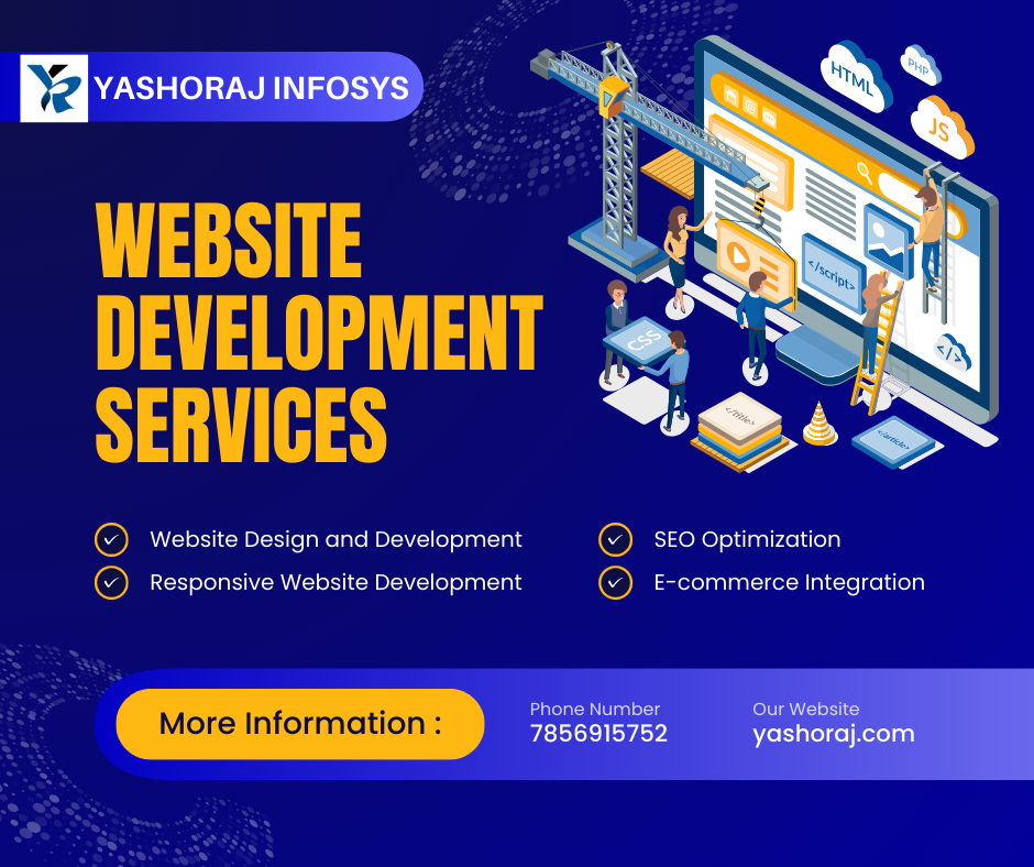
Top Website design company in Patna, For any kind of business website design and website development feel free to contact us on 7856915752