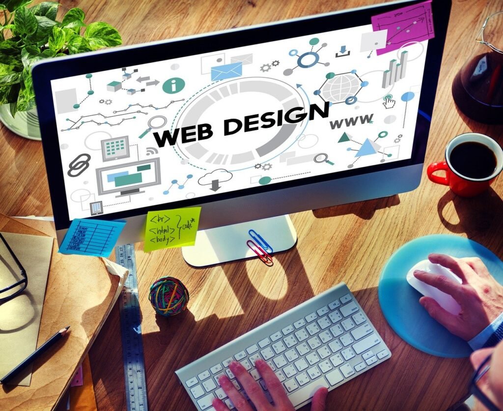
In the realm of web development, Cascading Style Sheets (CSS) play a crucial role in defining the visual presentation of a website. CSS allows you to separate content from design, enabling you to create aesthetically pleasing and user-friendly web pages. Whether you’re a beginner or an experienced developer, mastering CSS is essential for crafting engaging and responsive websites. In this comprehensive guide, we’ll explore the power of CSS and how it can elevate your website design and user experience.
Understanding the Basics of CSS
CSS is a stylesheet language used to describe the presentation of HTML documents. It controls the layout, colors, fonts, and overall appearance of web pages. By applying CSS, you can transform plain HTML into visually stunning websites.
1. CSS Syntax and Selectors
CSS consists of rules that define how HTML elements should be styled. Each rule contains a selector and a declaration block.
- Selector: Specifies the HTML element(s) to be styled.
- Declaration Block: Contains one or more declarations separated by semicolons. Each declaration includes a property and a value.
selector {

    property: value;

}
For example, to change the text color of all <p> elements to blue:
p {

    color: blue;

}
2. Types of CSS Selectors
CSS provides various selectors to target HTML elements:
- Element Selector: Targets all instances of an element.
h1 {

    font-size: 24px;

}
- Class Selector: Targets elements with a specific class attribute. Classes are prefixed with a dot (
.).
.intro {

    background-color: yellow;

}
- ID Selector: Targets a single element with a specific ID attribute. IDs are prefixed with a hash (
#).
#header {

    border-bottom: 2px solid black;

}
- Attribute Selector: Targets elements based on attributes and values.
input[type="text"] {

    width: 100%;

}
- Pseudo-classes and Pseudo-elements: Target elements based on their state or position.
a:hover {

    color: red;

}
p::first-line {

    font-weight: bold;

}
Layout Techniques with CSS
Effective layout design is key to creating visually appealing and user-friendly websites. CSS offers various techniques for layout management, including Flexbox and Grid.
1. Flexbox
Flexbox (Flexible Box Layout) is a one-dimensional layout model that allows you to design complex layouts with ease. It is particularly useful for arranging items in a single direction (row or column).
- Container Properties: Define the flex container and its behavior.
.container {

    display: flex;

    justify-content: space-between;

    align-items: center;

}
- Item Properties: Define the behavior of flex items within the container.
.item {

    flex: 1;

    margin: 10px;

}
2. CSS Grid
CSS Grid Layout is a two-dimensional layout system that enables you to create complex and responsive grid-based designs. It provides more control over rows and columns.
- Container Properties: Define the grid container and its structure.
.grid-container {

    display: grid;

    grid-template-columns: repeat(3, 1fr);

    gap: 20px;

}
- Item Properties: Define the placement and behavior of grid items.
.grid-item {

    grid-column: span 2;

}
Responsive Web Design
Responsive web design ensures that your website looks and functions well on various devices and screen sizes. CSS media queries allow you to apply different styles based on the viewport size.
1. Media Queries
Media queries enable you to apply CSS rules conditionally based on the device’s characteristics, such as width, height, and orientation.
@media (max-width: 768px) {

    .container {

        flex-direction: column;

    }

}
2. Fluid Layouts and Units
Using relative units like percentages (%), viewport width (vw), and viewport height (vh) helps create fluid layouts that adjust to different screen sizes.
.container {

    width: 100%;

    max-width: 1200px;

    margin: 0 auto;

    padding: 20px;

}
3. Responsive Typography
Ensure text is readable on all devices by using responsive typography techniques such as em, rem, and clamp.
body {

    font-size: 1rem;

}
h1 {

    font-size: clamp(1.5rem, 2.5vw, 3rem);

}
Advanced CSS Techniques
To further enhance your website’s design and user experience, explore advanced CSS techniques such as animations, transitions, and custom properties.
1. CSS Transitions
CSS transitions allow you to smoothly change property values over a specified duration.
.button {

    background-color: blue;

    transition: background-color 0.3s ease;

}
.button:hover {

    background-color: green;

}
2. CSS Animations
CSS animations enable you to create complex animations by defining keyframes and applying them to elements.
@keyframes slideIn {

    from {

        transform: translateX(-100%);

    }

    to {

        transform: translateX(0);

    }

}
.element {

    animation: slideIn 1s forwards;

}
3. CSS Custom Properties (Variables)
CSS custom properties, also known as CSS variables, allow you to define reusable values that can be referenced throughout your stylesheet.
:root {

    --primary-color: #3498db;

    --secondary-color: #2ecc71;

}
.header {

    background-color: var(--primary-color);

}
.button {

    color: var(--secondary-color);

}
Improving User Experience with CSS
Beyond aesthetics, CSS can significantly enhance the user experience by improving accessibility, readability, and interaction.
1. Accessibility
Ensure your website is accessible to all users, including those with disabilities, by following best practices in CSS.
- Contrast and Readability: Use sufficient color contrast between text and background.
body {

    background-color: #ffffff;

    color: #333333;

}
- Focus States: Provide visible focus indicators for interactive elements.
button:focus {

    outline: 2px solid #3498db;

}
2. Typography and Spacing
Good typography and spacing improve readability and create a more pleasant user experience.
- Line Height and Spacing: Use appropriate line height and spacing to enhance text readability.
p {

    line-height: 1.6;

    margin-bottom: 1rem;

}
- Font Choice: Choose web-safe fonts or use web fonts for a consistent look across devices.
body {

    font-family: 'Helvetica Neue', Arial, sans-serif;

}
3. Interactive Elements
Enhance the usability of interactive elements with CSS.
- Hover Effects: Use hover effects to provide visual feedback on interactive elements.
.button:hover {

    background-color: #2ecc71;

    transform: scale(1.05);

}
- Responsive Images: Ensure images adapt to different screen sizes.
img {

    max-width: 100%;

    height: auto;

}
OUR SOFTWARES
1. Advance Support Ticket System
2. Advocate Management System
3. Courier and Logistics Management System
4. CRM software pro version
5. Ecommerce portal (multiple vendor) + admin panel
6. Gym Management and Fitness Management
7. Hospital Management System
8. HR management system
9. Matrimonial web portal + admin panel
10. News portal with admin panel
11. Tour and Travel portal with admin panel
12. School management system pro version
13. Real Estate system
14. Project Management software (ultimate version)
15. POS system for restaurants
16. Point of sales system (POS)
17. Pharmacy Management System
18. Online job portal + admin panel
19. Online exam web portal + admin panel
20. Online classes and tutorial web portal + admin panel
IT services in Patna, Yashoraj Infosys, Digital transformation, best IT company in patna bihar, top 10 web design company in patna bihar, best web design company in patna bihar, top software company in patna bihar, website development company in patna bihar, Digital company in patna bihar, mobile application development company in patna bihar #PatnaIT #ITservicesinPatna, #YashorajInfosys, #Digitaltransformation, #bestITcompanyinpatnabihar, #top10webdesigncompanyinpatnabihar, #bestwebdesigncompanyinpatnabihar, #topsoftwarecompanyinpatnabihar, #websitedevelopmentcompanyinpatnabihar, #Digitalcompanyinpatnabihar, #mobileapplicationdevelopmentcompanyinpatnabihar